









If you’re searching for high resolution Garbage Pail Kids images, or just clear pictures of Garbage Pail Kids you can actually zoom into, congratulations: you’re either a serious collector, a nostalgic adult trying to reconnect with childhood, or someone who simply wants to stare at a cartoon child vomiting toys in crisp detail on a 27‑inch monitor.
All valid.
The concept is usually credited to Art Spiegelman, with iconic artwork by illustrators such as John Pound and Tom Bunk. The basic formula was brilliant and evil: each sticker card typically has two name versions; an “a” name and a “b” name, so Topps could sell you the same art twice with two different puns. Capitalism: it finds a way.
The cards were a cultural phenomenon, controversial enough that schools banned them, and Topps even got dragged into a lawsuit by the Cabbage Patch Kids licensor (Original Appalachian Artworks) in 1986, which forced design changes. In other words: the cards were so powerful that adults responded the way adults always respond to anything fun, by panicking and calling their lawyers.

Today, the obsession has evolved. We don’t just want the cards, we want GPK cards images in high resolution so we can zoom in, see tiny print differences, compare the back of Garbage Pail Kids cards, and argue online about whether a single asterisk belongs on the copyright line like it’s a constitutional issue.
So here’s your GPK guide: a narrative meta‑guide spanning classic 1985 originals, late‑series gimmicks, and modern reboot parallels, with the key stats collectors actually care about. Every card gets a scan, the story behind it, and its variation notes, and the full Garbage Pail Kids gallery is waiting at the end.
Why High Resolution Garbage Pail Kids Images Actually Matter
A low‑quality photo of a Garbage Pail Kids card is like watching a movie through a screen door: you get the idea, but you miss the details.
When you study high resolution Garbage Pail Kids cards images, you can actually see:
That’s the whole point of a page of high resolution Garbage Pail Kids images: show clean, well‑lit scans, and give people the context they came for. Nobody Googles “GPK cards images” because they want mystery.
GPK Guide: Every Card in This Gallery at a Glance
Use this GPK guide as a jump list: every card below with both names, its number, its series and when it came out. Tap a name to jump to its scan.
| GPK cards (a / b names) | Number | Series | Released |
|---|---|---|---|
| Up Chuck / Heavin’ Steven | 3a / 3b | OS1 | June 1985 |
| Tee‑Vee Stevie / Geeky Gary | 10a / 10b | OS1 | June 1985 |
| Adam Bomb / Blasted Billy | 8a / 8b | OS1 | June 1985 |
| Nervous Rex / Nerdy Norm | 24a / 24b | OS1 | June 1985 |
| Dirty Harry / Rob Slob | 52a / 52b | OS2 | 1985 |
| Ghastly Ashley / Acne Amy | 77a / 77b | OS2 | October 1985 |
| Ali Gator / Marshy Marshall | 100a / 100b | OS3 | January 1986 |
| Penny Larceny (wanted back) | back variation | OS3 | 1986 |
| Iron‑Jaw Aaron / Jean Machine | 186a / 186b | OS5 | August 1986 |
| Radar Ray / Eve Droppin | 240a / 240b | OS6 | November 1986 |
| Wind Sheila / Hit N’ Ronnie | 285a / 285b | OS7 | 1987 |
| The Garbage Gang (Flick‑It) | panel card | OS11–OS14 | 1987–1988 |
| Sunken Trevor / Anchored Hank | 491a / 491b | OS12 | March 1988 |
| Paddlin’ Adeline / Rikki Racket | 519a / 519b | OS13 | June 1988 |
| Big Hair Sher / Hairy Geri | 1a / 1b | We Hate the ’80s | 2018 |
| Trimmed Tim / Wasted Wilson | 4a / 4b | We Hate the ’90s | 2019 |
Old Series 1 GPK Cards (June 1985): The Moment Childhood Went Off the Rails
Now let’s go card by card, mostly in a loose chronological flow, like a guided museum tour, if the museum were located behind a convenience store and everything on the wall was medically concerning.
Up Chuck (#3a) / Heavin’ Steven (#3b)
The Card That Set the Tone by Throwing Up on It

This card did something important for Garbage Pail Kids: it clarified the rules. The rules are that there are no rules. The rules are that your lunch can come back up, and it can bring friends.
And in any collection of high resolution Garbage Pail Kids images, Up Chuck is one you want scanned cleanly, because early series print/finish differences are exactly what collectors zoom in on like forensic accountants.
Tee‑Vee Stevie (#10a) / Geeky Gary (#10b)
Predicting Brain Rot Before It Was Cool

Of course, now we all carry the TV in our pocket and willingly stare at it until our souls turn into beige paste. So yes, the card aged beautifully. Like milk. Like a warm gallon of milk in the trunk.
If you’re curating GPK cards images in high resolution, Tee‑Vee Stevie is a great example of why you want crisp scans: the hypnotic screen details and linework are half the gag.
Adam Bomb (#8a) / Blasted Billy (#8b)
The Mascot, the Legend, the Lawsuit‑Bait

He’s a bald kid sitting calmly, pressing a detonator, while a mushroom cloud erupts from his skull. And somehow he looks relaxed. That’s the best part. If your head is exploding and you’re still sitting cross‑legged like you’re waiting for a dentist appointment, you’re either enlightened… or you’ve accepted reality in a way none of us ever will.
The name is a pun on “atom bomb,” which is the kind of wordplay that makes you realize these cards were created by adults who absolutely could’ve been doing something productive, but chose this instead. Thank God.
Adam Bomb also became a marketing engine. His image showed up on wrappers for the first five series, because Topps understood that if you want kids to buy something, you put a nuclear detonation on it. Basic consumer psychology.
And from a collecting standpoint: this isn’t just a famous card; it’s the famous card. High‑grade copies are a different world entirely, people will pay real money for a tiny sticker of a child detonating himself.
Nervous Rex (#24a) / Nerdy Norm (#24b)
The Patron Saint of Caffeine Dependency

The pun is “nervous wreck,” which is exactly the sort of pun you’d expect from a product line that also gave us “Up Chuck.” These are not complicated people.
And as with many OS1 cards, if you’re scanning high resolution GPK cards images, Nervous Rex is one where the small print and back differences can matter to collectors. Early series printing runs created the kind of obsessive variation hunting that keeps the hobby alive… or keeps therapists employed. Either way.
Series 2 and 3 (1985–1986): Pictures of Garbage Pail Kids Where the Variations Multiply
Rob Slob (#52b) / Dirty Harry (#52a)
The Mud‑Puddle Lifestyle Influencer

The “Dirty Harry” alternate name is a Clint Eastwood reference, which is hilarious because Clint Eastwood would not tolerate this. Clint Eastwood would glare at Rob Slob until the mud evaporated out of fear.
From a collector’s perspective, OS2 is where variations start multiplying like bacteria in Rob Slob’s personal ecosystem. Matte vs glossy. Star/asterisk counts. Puzzle preview differences. That makes Rob Slob exactly the kind of card where people hunt for crisp pictures of Garbage Pail Kids cards, because it’s the only way to compare print details without owning every copy.
Ghastly Ashley (#77a) / Acne Amy (#77b)
The Close‑Up That Launched a Thousand Insecurities

It’s cruel. It’s funny. It’s also weirdly detailed, which is why high resolution scans of this one are genuinely useful. In low resolution, it’s just “acne.” In high resolution, you can appreciate the artistry of turning adolescence into a medical diagram.
Series 2 is also known for having a lot going on in the background of collecting: different stocks, different backs, multiple print nuances. This is where “I just want the card” turns into “I need the matte back, the right preview, and the correct print line,” which is how hobbies become personality traits.
Ali Gator (#100a) / Marshy Marshall (#100b)
The Swamp Creature With Movie‑Star Energy

And yes, Ali Gator is one of the characters who made it into The Garbage Pail Kids Movie (1987), where he’s portrayed as a leader who bites toes. So if you ever wondered what the writers were doing, drugs. They were doing drugs.
On the collecting side, Ali Gator sits in a number range where star/asterisk variations matter because Topps used different printing plates. In other words, if your GPK cards images aren’t high resolution, you’ll miss the tiny details that distinguish versions. And missing tiny details is how you end up buying the same card twice and pretending it was “intentional.”
Penny Larceny (Candy Store Owner): The Wanted Back
Because Even the Back of Garbage Pail Kids Cards Has Jokes

The “Wanted for Penny Larceny” back is exactly what it sounds like: a parody wanted poster describing a laughably petty “crime,” with a mock reward. It’s one of those Topps touches that reminds you the company wasn’t only selling stickers, they were selling a whole ecosystem of jokes.
These wanted backs show up as variations in certain Series 3 contexts, sometimes replacing what you might otherwise expect (like puzzle pieces). If you’re cataloging high resolution Garbage Pail Kids images, scan the back of Garbage Pail Kids cards too. People absolutely hunt for these, and a clean back scan is often harder to find than the front because kids treated card backs like scrap paper.
Series 5 to 7 (1986–1987): Mid‑Run Puns, Ears and Windshields
Iron‑Jaw Aaron (#186a) / Jean Machine (#186b)
The World’s Most Unsettling Vending Machine

The “Jean Machine” alternate name adds a weird extra layer, part denim reference, part “gene machine” wordplay. It’s the kind of pun that sounds like it was pitched at 2 a.m. in a room full of exhausted illustrators and one guy who hadn’t slept since Series 1.
Variation-wise, this one is refreshingly straightforward compared to some others: it’s not known as one of the major star‑variation chase numbers in its series, so most of the collecting focus is on condition and set completion. Which, frankly, is a relief. Not every card needs to be a forensic project.
Eve Droppin (#240b) / Radar Ray (#240a)
The Human Wiretap

Eve Droppin is a kid with massive, radar‑dish ears, grinning like he just overheard your secrets and plans to treat them as public entertainment. The pun is obvious “eavesdropping” but GPK was never about subtle wordplay. It was about blunt instruments. Sometimes literal blunt instruments.
Art-wise, this is one of those Tom Bunk‑type exaggerations where the physical trait becomes the entire joke. And it works. It’s also oddly relevant now, because we live in an era where everyone is “concerned about privacy,” right before they install another smart device in their home and give it permission to listen forever.
Series 6 cards are also one of those areas where you can find small print differences depending on which printing plate was used. That’s why, if you’re curating GPK cards images, high resolution matters: you want the tiny copyright line and marks to be readable, not a blurry suggestion.
Wind Sheila (#285a) / Hit N’ Ronnie (#285b)
The Windshield Splat Heard Round the World

Wind Sheila is pressed against a windshield like a human bug on a summer highway. The joke is pure slapstick: impact, splatter, grim acceptance. And yes, it’s dark. That’s kind of the point. Garbage Pail Kids were always testing where the line was, then sprinting past it with scissors.
This card is also a good reminder that GPK wasn’t only “gross” in the bodily sense. It was gross in the “laughing at minor tragedy” sense too, which is why adults hated it and kids loved it. Kids instinctively understand that everything in life is absurd; adults prefer denial.
From a variation standpoint, Wind Sheila isn’t usually singled out as a major star‑variation chase within OS7; it’s more of a classic mid‑run character card. So collectors mainly hunt for clean examples, and fans keep it around because the image is unforgettable in that “I probably shouldn’t be laughing” way.
Late Original Series (1987–1988): Flick‑It Backs and Darker Gags
“The Garbage Gang” Flick‑It Instruction / Panel Card
Analog Animation for the ADHD Generation

At some point, Topps decided that just selling disgusting stickers wasn’t enough. They needed a gimmick. Something interactive. Something that would keep kids buying packs even after their parents started confiscating them like contraband.
Enter Flick‑It: the instruction/panel concept where you stack a chunk of cards and flip them with your thumb to create a crude animation. It’s basically a flip book, except instead of one booklet, it’s scattered across your collection in a way that guarantees you’ll never complete it unless you become the sort of person who says things like, “I’m only missing frame 37.”
The deep‑cut collector detail, and yes, you want this in a high resolution archive because people do check, is how the frames were distributed: “a” cards carried odd‑numbered frames and “b” cards carried even‑numbered frames, totaling 40 frames for a full sequence. Some later international configurations even omitted certain frames, which is the kind of detail you only learn after you’ve invested too much time and can’t emotionally quit.
Anchored Hank (#491b) / Sunken Trevor (#491a)
Tongue‑Tied to the Ocean Floor

The pun game here is also strong: Sunken Trevor riffs on “sunken treasure,” while Anchored Hank is basically “what if your name was Hank and your life was a nautical punishment?”
For collectors, OS12 is part of that end‑stretch of the original run. Print runs were smaller than the early heyday, interest was shifting, and yet the art still had detail worth preserving, especially in a Garbage Pail Kids gallery that shows how the style evolved across the years.
Paddlin’ Adeline (#519a) / Rikki Racket (#519b)
Paddle Ball, But Make It Anatomical

The b‑name, Rikki Racket, riffs on rock‑and‑roll naming (a nod tied to glam‑metal culture), which fits the late‑80s vibe: everything had to be louder, flashier, more extreme. If OS1 was “gross,” OS13 was “gross, but with a bigger budget and more confidence.”
From a variation standpoint, the late series can be messy in a different way than early series. Instead of just stock and small print differences, you start seeing more experimentation with back types; puzzles, checklists, and Flick‑It panels floating around the ecosystem depending on the card and print configuration.
Modern GPK Cards (2018–2019): Disposable Income Meets Unresolved Nostalgia
Eventually Topps realized something: adults who grew up with GPK now have disposable income and unresolved nostalgia. So modern GPK sets lean into decade‑themed satire and modern collecting mechanics like rainbow parallels.
This is where “I bought one pack for fun” becomes “I need it in Bloody Nose Red, Bruised Black, and Serial‑Numbered Whatever‑Color,” and suddenly your budget is gone.
Hairy Geri (#1b) / Big Hair Sher (#1a)
We Hate the ’80s (2018): The Aquanet Monolith

The humor here isn’t primarily “gross”; it’s cultural parody. It’s Topps saying, “Remember how insane we all looked?” And yes. Yes, we do.
If you’re assembling high resolution GPK cards images for modern sets, high‑res matters because modern collectors care about border colors, parallel names, print finishes, and numbering, details that get lost in blurry phone photos.
Trimmed Tim (#4a) / Wasted Wilson (#4b)
We Hate the ’90s (2019): Home Improvement, But With More Blood

The b‑name Wasted Wilson winks at sitcom culture (the Home Improvement neighbor reference), which tells you what modern GPK does best: it trades pure gross‑out for pop‑culture satire, then sprinkles in some bodily damage for tradition. It’s a balanced diet.
Collecting‑wise, modern sets are where you’ll see the long list of parallel color names, some of which sound like paint samples from a haunted hardware store: Bloody Nose Red, Bruised Black, Jelly Purple, etc. High resolution images help people verify which parallel they’re looking at, especially when lighting makes colors lie.
Conclusion: The Weird Little Stickers That Never Really Went Away
When you line these up, from Up Chuck and Adam Bomb detonating childhood in 1985, through mid‑run variation madness, into late‑series darkness like Anchored Hank, and finally into modern parallel‑heavy nostalgia like Hairy Geri and Trimmed Tim, you realize something:
Garbage Pail Kids never needed to be “appropriate.” It needed to be memorable.
And that’s why people are still searching for high resolution Garbage Pail Kids images today because the jokes are in the details, the collecting is in the variations, and the art is still weirdly good for something that exists primarily to offend your parents.
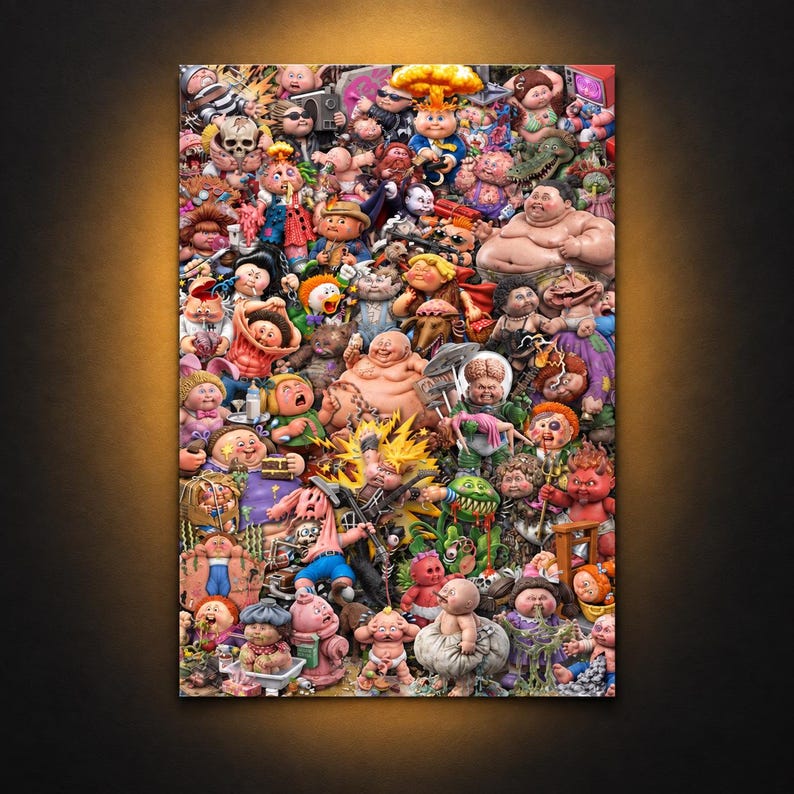
- Sizes: 8×12 up to 24×36
- Paper: thick 10 mil poster stock with a slightly glossy, fingerprint-resistant finish
- Made for: collectors, nostalgic adults and anyone whose parents confiscated their stickers
The Full Garbage Pail Kids Gallery: High Resolution Pictures of Every Card
As promised up top: every card from this GPK guide in one place. Click any thumbnail to open the full‑resolution scan.


More from Editor Picks

Pareidolia: Why You See Faces in Everyday Objects
You have seen a face in a car's front grille. In the two screws and a slot of a wall …
Cartoon Doppelgängers: When Real Life Takes a Detour to Looney Town
Have you ever walked down the street, looked at someone, and thought, “Wait a minute, why does it look like …
Only 1% Get Every Question Right: Are You One of Them?
This quiz doesn’t care about your GPA, your LinkedIn bio, or your self-esteem 💡 It only cares about right answers …